Power BI · built with Claude Opus 5.5
SenMinh group report — Power BI, built with Claude
A decision-led Power BI report for a fictional group of seven international schools, on 100% synthetic data — built as code with Claude Code, and checked by script and by eye before every merge.
Access is by invitation. If Power BI asks you to sign in, ask me for access.
What this is, plainly
SenMinh Education Group does not exist. It is a fictional group of seven international schools — four in Vietnam, three in the UAE and Qatar — that I invented so I could build a report the way I would for a client, without exposing anyone's data. Every student, teacher, school and dollar in it is synthetic, produced by a Python script with a fixed seed, so the whole dataset can be rebuilt identically.
It is here for two reasons. It shows what a decision-led Power BI report looks like when every page can be shown in full, which in-house work never can. And it tests a question worth answering with evidence rather than opinion: can an AI coding assistant produce a report that holds up to enterprise standards, and what does it take to make it?
Built around decisions, not tables
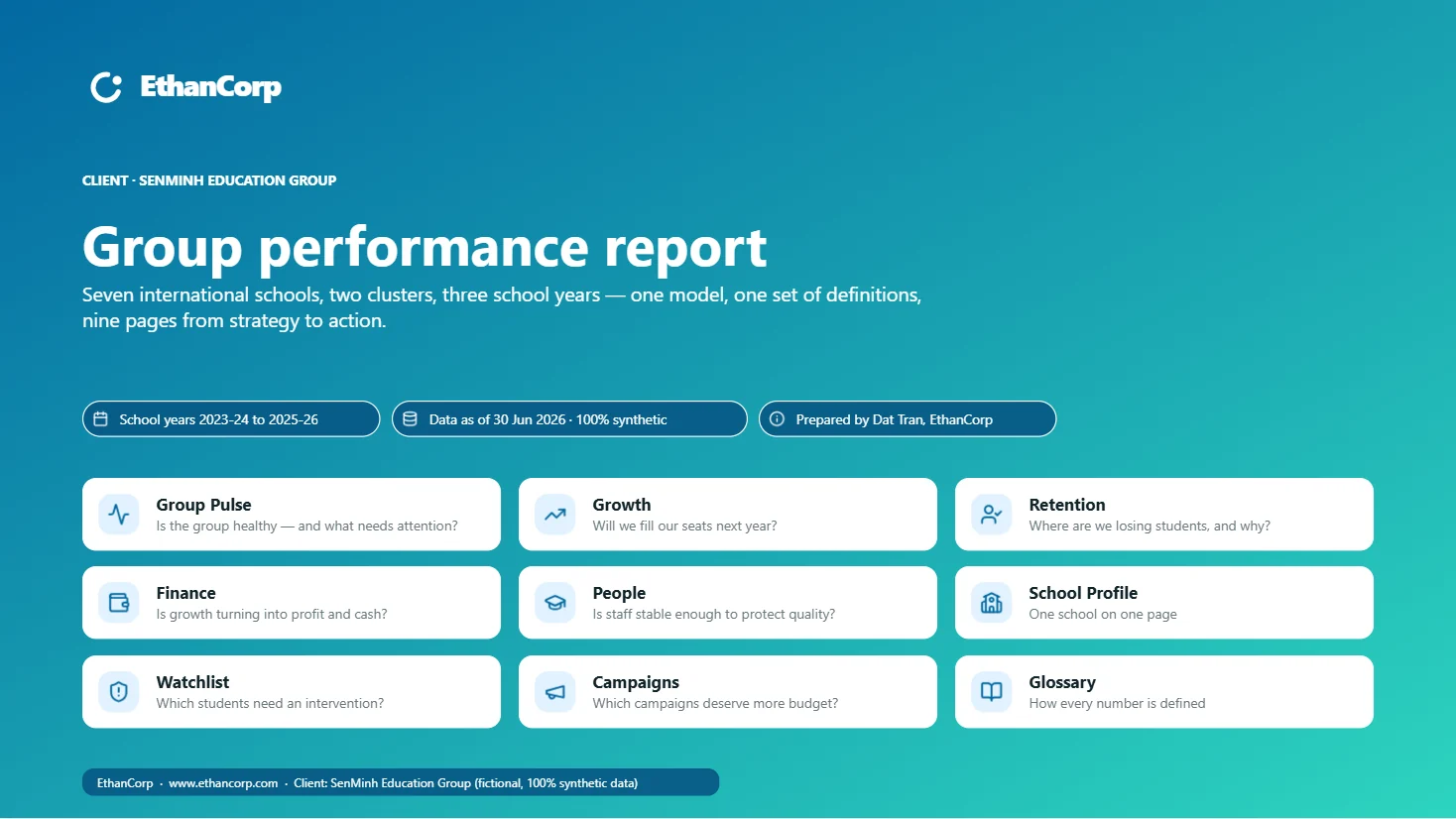
The first version was organised the way most reports are: one page per group of tables. Every page was accurate and none of them answered anything. The rebuild starts from the decisions instead — ten pages in three tiers, strategic, diagnostic and action, each printing its business question at the top: Is the group healthy, and what needs attention right now? Is growth turning into profit and cash? Which students need an intervention before next year?
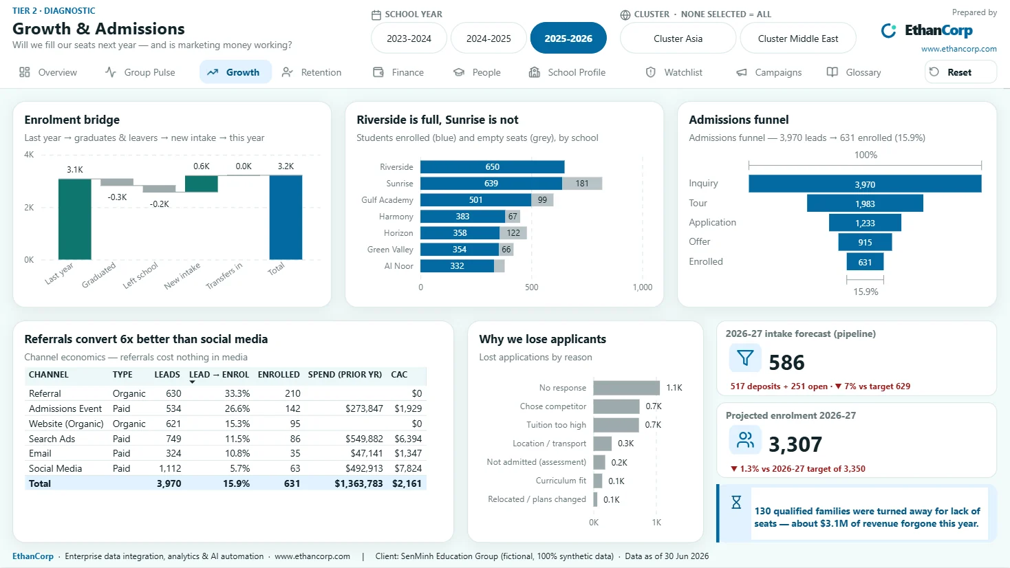
- Visual titles state the conclusion, not the metric: "Riverside is full, Sunrise is not" rather than "Enrolment by school".
- No number stands alone. Every KPI tile shows its change against the prior year and against target, driven by one calculation group instead of three copies of every measure.
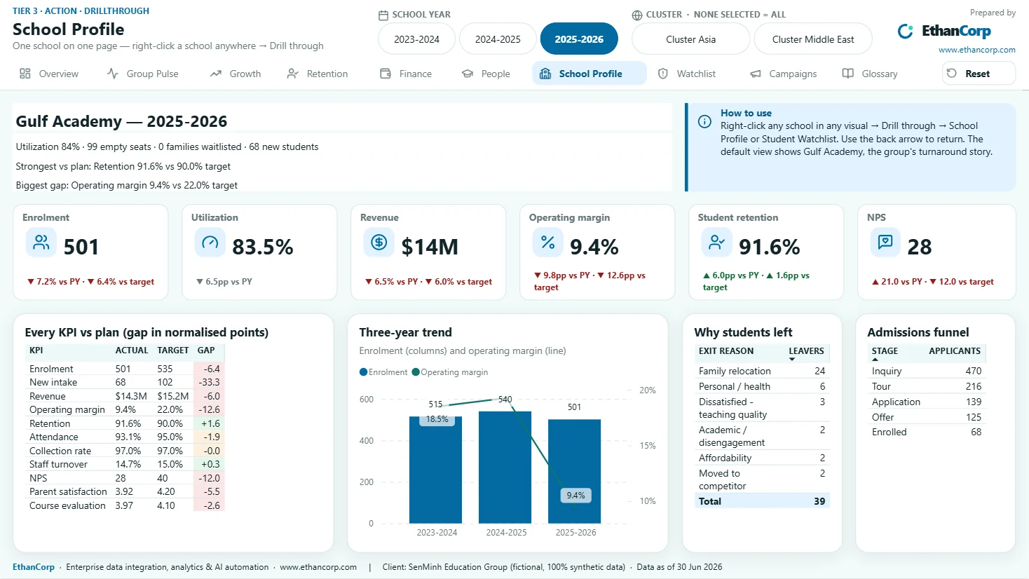
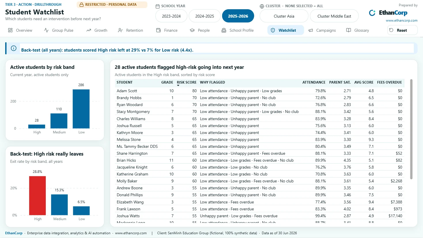
- Three clicks or fewer from the group view to an action: right-click any school to drill through to its School Profile or its Student Watchlist.
- One semantic model for every audience — board, CFO, cluster directors, principals — with dynamic row-level security deciding who sees which schools.
- Red is reserved for exceptions. Colour carries status, never decoration, and every text and background pair is checked for WCAG AA contrast.
What the report surfaces
Eight business stories were planted in the data on purpose, and the answer key was written before the report was built. The test of the report is whether it surfaces them without being led there. Because the stories were planted, that shows the report can surface a known answer — not that it would find an unknown one. On real data, the second part is what agreeing definitions and measuring a baseline are for.
Some of what it shows for the 2025–26 school year — every figure synthetic:
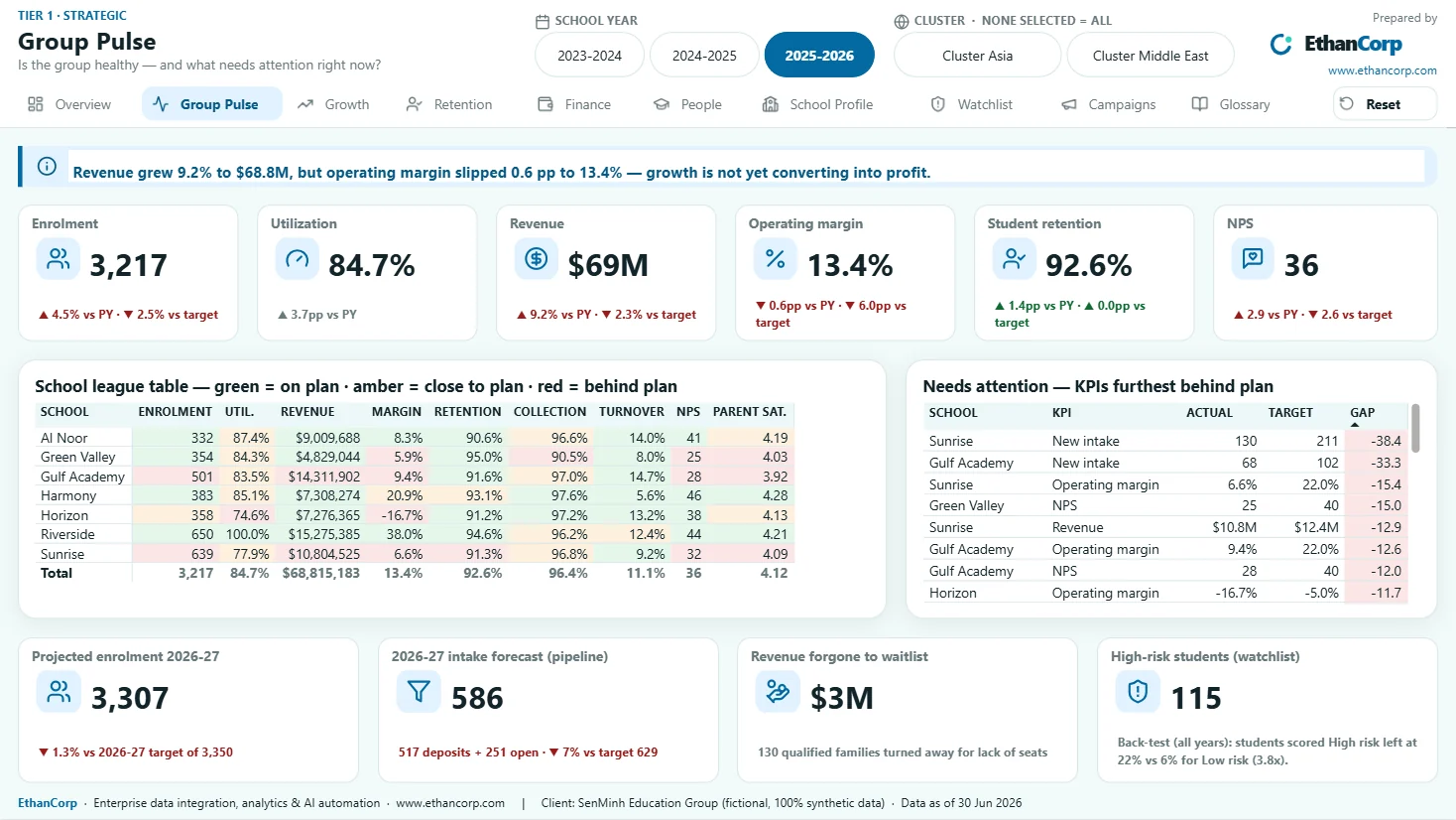
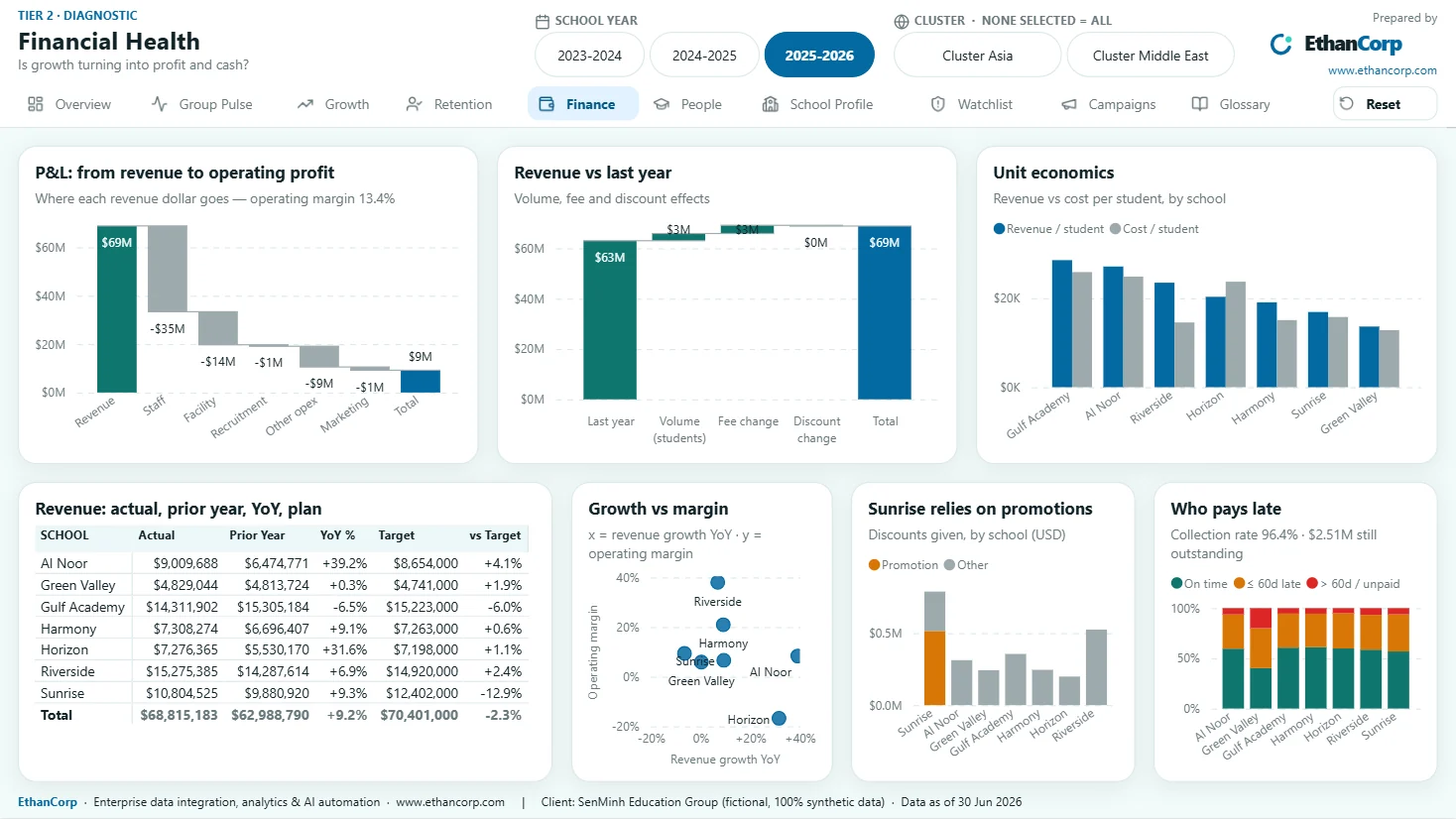
- The headline: revenue grew 9.2% to $68.8M, but operating margin slipped 0.6 points to 13.4%. Growth is not yet turning into profit.
- Riverside is 100% full. 130 qualified families were turned away for lack of seats — about $3M of revenue forgone in a year. Expansion money belongs there.
- Sunrise expanded and did not fill: 77.9% utilisation and a 6.6% operating margin against a 22% plan, with part of its enrolment bought through promotions.
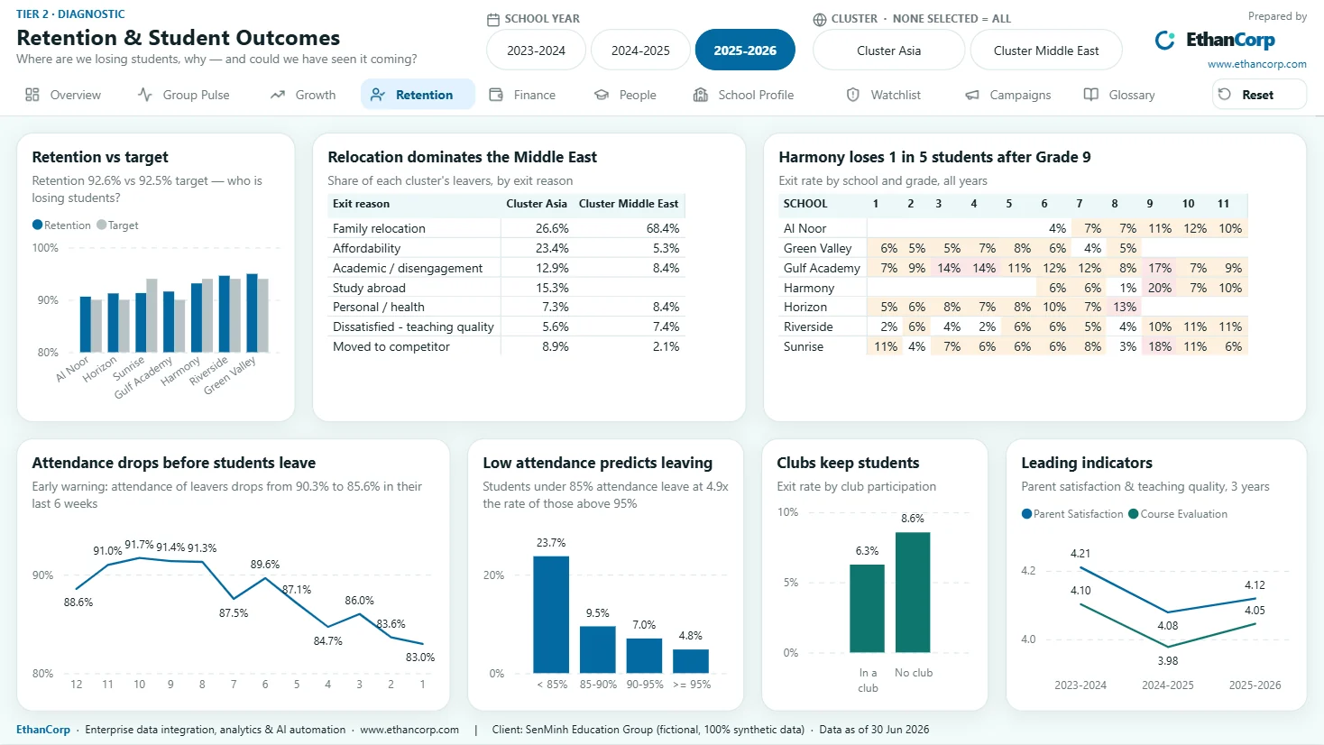
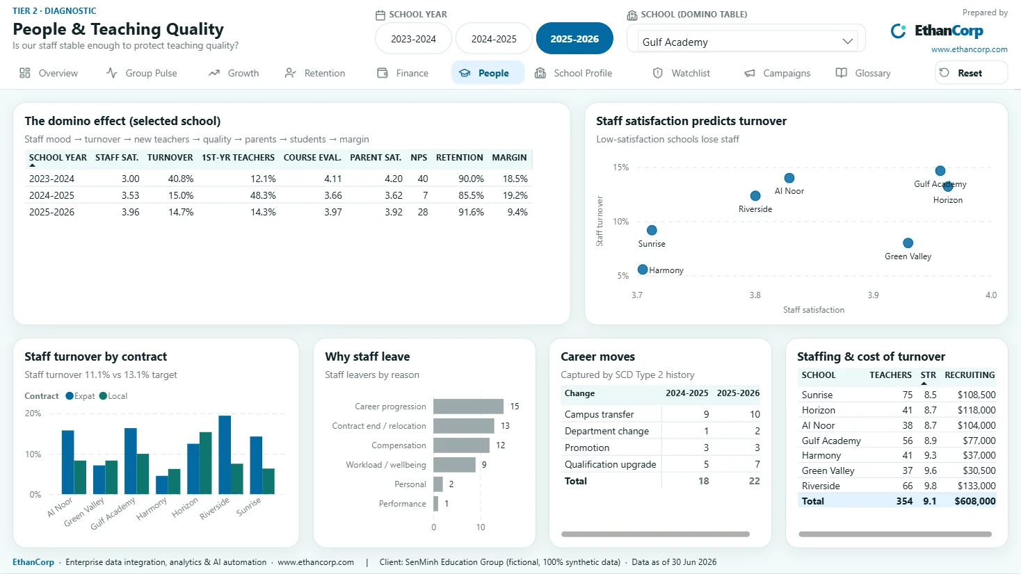
- Gulf Academy shows the domino effect. Staff satisfaction of 3.00 came before 40.8% staff turnover; the next year NPS fell from 40 to 7 and retention to 85.5%. Staff satisfaction was the early warning.
- Green Valley collects 90.5% of what it bills, the weakest in the group — a credit-control problem before it is a pricing one.
How Claude built it
Nothing in the report was built by dragging visuals onto a canvas. Claude Code, running on Claude Opus 5.5, wrote Python that generates the whole project as text files Power BI reads directly: the semantic model as TMDL and the report as PBIR. Rebuilding the report is a script run, and every change is a reviewable diff in Git.
- Data: a scenario-driven generator in which tables are linked by cause and effect — staff satisfaction drives turnover, turnover drives teaching quality, teaching quality drives parent satisfaction and retention. A validator reconciles the tables against each other and checks every planted story, and must report zero failures before new data is committed.
- Semantic model: 35 tables, 44 relationships on surrogate keys, 194 measures in display folders, a Time Comparison calculation group, and dynamic row-level security at group, cluster and school level.
- Report: 10 pages plus 2 tooltip pages on the EthanCorp design system, with Lucide icons, a Reset filters bookmark and alt text on every visual.
- Verification: the PBIR is validated against Microsoft's published JSON schema, the model is loaded through the Tabular Object Model, contrast is computed for every text and background pair, and Power BI Desktop is opened, refreshed and captured page by page for review.
- Process: feature branches and pull requests, 37 commits between 21 August and 7 October 2026. The traps met along the way are packaged as a reusable skill, so the next report starts with them already known.
What I decided, what Claude did
I set the decision questions, the eight scenarios, the KPI tree and the design system, and reviewed every page. Claude Code, on Claude Opus 5.5, wrote the data generator, the DAX, the TMDL and PBIR generators and the verification tools, and rendered and screenshotted each page for my review.
That split is the point. The assistant is fast and thorough at the code; it does not know which question a CFO needs answered on Monday. A report built by an assistant with no brief is a tidy report about the wrong thing. And PBIR has traps that a model walks straight into — an integer property that needs an L suffix, a tooltip that silently inherits the page's year filter. Each one met on this project is now written down, and the checks exist so the next one is caught before a reader finds it.
Constraints
- Synthetic data is cleaner than real data. There are no late corrections, no duplicate students across systems, no source that changes its export format overnight. That is where real projects spend their time, and this one does not exercise it.
- The report has not yet been tested with viewers who did not know the planted answers. Until it has, the claim is that the answers can be found, not that people find them.
- Row-level security was tested by impersonating roles in Power BI Desktop, not with real accounts in the Power BI Service.
- The published copy on the Power BI Service opens only for people I have given access to.
- Driving the model through Microsoft's Power BI modelling MCP server needs an interactive sign-in, so unattended runs fall back to writing TMDL directly.
Inside the report
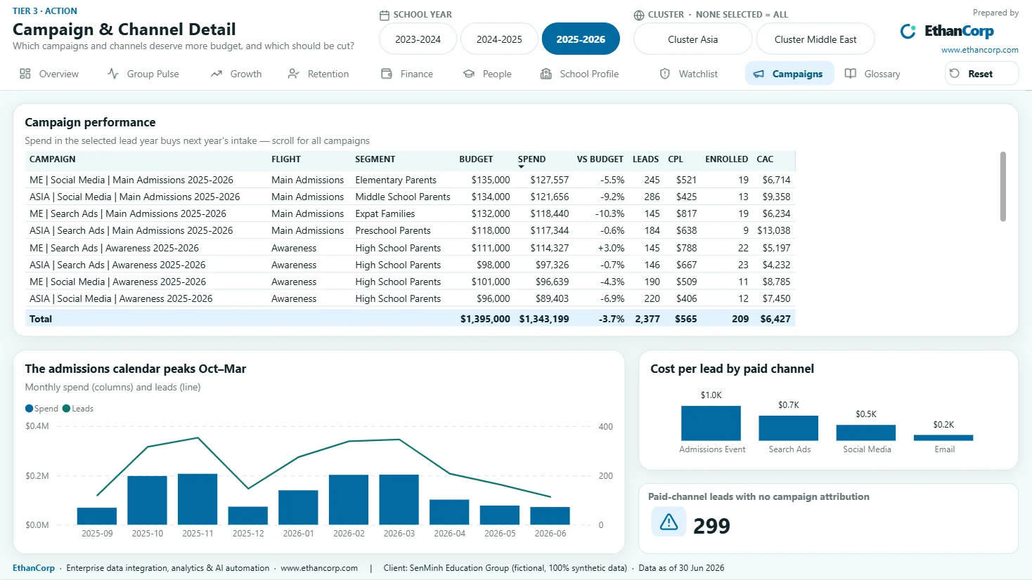
Every page, as rendered.
Captured in Power BI Desktop for the 2025–26 school year, all clusters. Every name and number is synthetic. Select an image to open it at full size.
Outcome
The measured result.
Lessons
What I would tell the next team.
- Start from the decision, not the data. The first version of this report had every table and answered nothing; the rebuild has fewer visuals, and every one of them has a conclusion for a title.
- Report as code is what makes an assistant useful in Power BI. A text file is something an assistant can write, a script can check and a reviewer can diff. A canvas is none of those.
- Automate the checks you would otherwise take on trust. The schema, the model load and the contrast check catch what a confident model gets wrong; the screenshot review catches what no script can, which is whether the page makes sense.

Dat TranEnterprise Data & AI Analytics Architect — the person behind EthanCorp.
Questions
Common questions about the SenMinh report.
Is this real client data?
No. SenMinh Education Group is fictional, and every name and number in the report is synthetic, generated by a script with a fixed seed. The report's own footer says so on every page.
Can I open the report?
It is published on the Power BI Service, and access is by invitation. If you would like to explore it, ask through the contact page and I will share it with you.
Could EthanCorp build this on our data?
Yes — that is the service this demonstrates. On real data the work usually starts with a fixed-scope review such as the KPI Definition Audit, because agreeing definitions and mapping sources is where real projects spend their time, and where synthetic data cannot help.
Does using Claude mean our data goes to an AI provider?
In this project the assistant only ever saw synthetic data. On a client project, what an assistant is allowed to see is your decision, made before any work starts — and building against schemas and sample data, without the assistant reading production records, is one option.
Have a data, analytics or automation problem that should not need another workaround?
Tell me what is breaking and what you have already tried. If EthanCorp is not the right fit, I will say so and point you somewhere better.
- Response time
- Within two business days
- dattran.bi@gmail.com
- Based in
- Ho Chi Minh City, Vietnam — working across Asia and remote